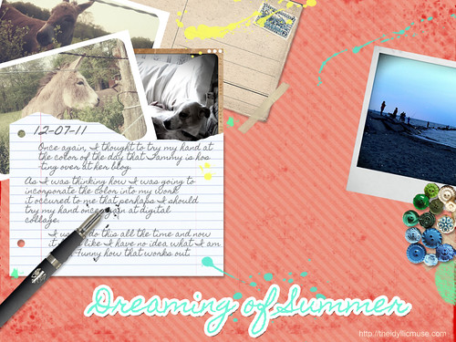
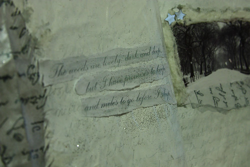
I've been running around all day but found this lovely representation of the color of the day.
Saturday, December 10, 2011
Thursday, December 8, 2011
Daisy Yellow: Building a Rainbow - Five Days of Color: Salmon
Hello everyone and welcome to the five days of color challenge hosted by Daisy Yellow. Please be sure to check out Tammy's blog as she is the hostess for my partner color: Pale Pink.
Salmon is an interesting color as it seems to meander between pink and orange. If you go one or two steps too far either way on the hue chart, you'll have missed that combination that makes Salmon what it is. When I think of this color, automatically my thoughts run into memories of summer. Coconut oil and tanned bodies warming themselves under the noon day sun. It is the color of the Caribbean as you walk past colorful houses brightly painted in cheerful brights that make them look like delicious candy.
For this color I thought I wold revisit something I have no done in ages; Digital art. The amazing thing about digital collage/art is the myriads of things that are at your disposal. You can literally create anything your mind conjures up without having the limitations of materials on hand.
Some inspiration via Flickr:
1. Salmon Colored Buds, 2. Turquoise and Corals Wrap Bracelet, 3. Salmon Lucite Dahlia Cabochons, 4. Raindrops on poppies and whiskers on kittens..., 5. Painted Mural, Cordoba, Spain, 6. Salmon, 7. salmon rice bento, 8. chiyogami paper and salmon coloured resin bangles, 9. Simple Swirl Earrings, salmon, 10. Wall of Cafe Laurent, 11. IMG_7110, 12. Salmon, 13. To Draw You In ..., 14. Salmon?, 15. Gerbera daisy with raindrops, peach color, contrast enhanced, 16. salmon-ish chair
Prompts:
1. Try your hand at something different today. Do you usually go for your watercolors; then why not try acrylics? Do you continuiously buy pre mixed colors (like craft paint?) Well then why don't you try your hand and mixing colors to find the perfect shade of pink or salmon?
2. Find colors in unsual places. Grab your camera and pay attention to the world around you. Can you find the color of the day in your surroundings?
3. Why not add a little hidden note about what the color reminds you of. A small piece of poetry, prose a simple list and then add it to your artwork/journal page in an inconspicuous place.
Make sure you add your links with your work for this color over at Daisy Yellow. :)
Wednesday, December 7, 2011
Technique Spotlight: Color theory
In continuation with yesterday's theme of finding inspiration and tutorials away from the usual places, I give you this lovely little writeup on color by sashas from deviantart. This one focuses on educating the reader on color theory and how it can e used effectively in our art. (These are also things that can be applied to your art journals as well.):
The Color Tutorial - Part 1 by ~sashas on deviantART
The Color Tutorial - Part 2 by ~sashas on deviantART
The Color Tutorial - Part 1 by ~sashas on deviantART
The Color Tutorial - Part 2 by ~sashas on deviantART
Tuesday, December 6, 2011
Technique Spotlight: Paper dying / staining
Many times we get so hyper focused on the community that surrounds us that people tend to forget that there is a larger art community out there with an amazing wealth of knowledge waiting to be shared. Places like Deviantart can be an encyclopedia of information when it comes to art technique. Most if not all offered up for free. The next time you are stuck or wish to experiemnt and learn a new medium, check out sites like Deviantart and see if you can search and discover a few nuggest of wisdom that might take your art in a completely different direction.
Our technique spotlight for today comes from Deviantart and features a few technieques for aging and dying paper. This is a great way to create unique and orignal collage papers for you to use in your art or art journals
How to Dye Paper by `hibbary on deviantART
Our technique spotlight for today comes from Deviantart and features a few technieques for aging and dying paper. This is a great way to create unique and orignal collage papers for you to use in your art or art journals
How to Dye Paper by `hibbary on deviantART
Monday, December 5, 2011
Daisy Yellow: Building a Rainbow - 5 Days of Color: White
Welcome my color acolytes (this is going to have to stop. I'm going to run out of witty ways to welcome you. *laughs*) Once again I am hosting a color for day five of our Building a Rainbow Challenge hosted over at Daisy Yellow. When you're done here, check out the Daisy Yellow blog to see my partner in crime for today, BLACK.
White is an interesting color as it is in fact the absence of color. It is the symbol of purity and cleanliness. In some cultures it is the color of mourning. White can elude to the delicate, the gossamer and ethereal. It is the mist between worlds and the shorud that hides you from dreams. White is an alpha/omega color. It can be whatever it is that need it to be.
It is also the bane of my exsistence. Now, I have seen gorgeous, fantastic minimalist work done by photographers, artists and journalists. They are masters of the powerful message white can deliver when used correctly. It's just not my color of choice. So, this page was a true challenge for me. I thought: What did I want to convey with this journal page? What feelings did I want to invoke? I decided upon layers. I wanted to stay white on white but that the interest would be texture and layering. I am not sure if I accomplished it to my satisfaction but I have to say that I did like the outcome.:
Some amazing inspiration via Flickr:
1. White Flower / Flower White / Macro / soft macro/, 2. White Daisy / Daisies -, 3. White Lotus Flower Macro / White on white / Lotus, 4. White Flower / Flower Macro / close up flower / closeup / nature / white / : IMGP4921, 5. Soft Macro - White on White - Azalia: IMGP6955, 6. White on white (on white), 7. nights in white satin, 8. white, 9. White, 10. white, 11. White shells, 12. white on white, 13. white sphere, 14. White blossom close up - IMGP6556, 15. white on white 06, 16. WHITE SANDS NATIONAL PARK
How did you incorporate white into your art today?
Saturday, December 3, 2011
Daisy Yellow: Building a Rainbow - 5 Days of Color: Aqua
My entry for this color:
Oh, AQUA , How I love thee. You are the color of my dreams floating in the ether. You are the waters of the Caribbean that beckons me in fantasies and the the patina of ancient stories that like to play out in my mind. I draw you out in intricate scrolls and elegant sweeping flourishes. You are the roar of the sea as it crashes upon the shore and the cool smooth porcelain of my favorite tea cup. You are clam and serenity and my affection borders on obsession at times. I might stray and find myself in the playgrounds of other colors but to you I will always return. I just can't help it.
Do you love a color in this manner? Let me know.
1. {121/365} aqua, jodi aqua, 2. Free Little Girl in Turquoise Sea Creative Commons, 3. aqua crinoline hazel atlas teacup, 4. aqua metal, 5. Aqua, 6. Aqua door - Trinidad, Cuba, 7. turquoise bricks, 8. Tiny Flowers, 9. I'm All Alone & It's So Cold, 10. aqua fence, 11. Aqua Skies , 12. Aqua, Green Wreath, 13. Rusty Bell, 14. Orange Koi ~ Turquoise Tile, Um Hmmm!, 15. i don't sleep, i dream, 16. purple martin
This is one of my favorite journal spreads from the lovely Ms. Juliana Coles. Her use of aqua with lavenders, greens, and sepia colors makes me think of an Atlantis where the sun dapples the watery deep.
Friday, December 2, 2011
Daisy Yellow: Build a Rainbow - 5 Days of Color: Yellow
Welcome color warriors to day two of our Building a Rainbow Challenge hosted over at Daisy Yellow. When you're done here, check out the Daisy Yellow blog to see my partner in crime for today, ORANGE.
Below is my own entry for this challenge:
What do you think of when your read the color YELLOW? When I think of the color, the thought of the summer sun filtering through lush green leaves that stretch out into an expansive deep blue sky comes to mind. I think of the way the sand radiates warmth against my skin or the tang of lemonade as it refreshes me on a hot day. Colors are more than a visual. They can morph into sensory triggers. A touch, taste or memory of something that lingers in the back of your mind. So, today when you express yourself using this color - in whatever form it takes - think of what it represents to you and then explore. In the end, you might be surprised as to what comes out.
1. Yellow Rose - IMG_8490, 2. Yellow, 3. yellow 2, 4. guthrie theater yellow room minneapolis, 5. Yellow Pear Tomatoes 012, 6. Yellow Earth, 7. yellow river, 8. Yellow, 9. Yellow Pepper Redone, 10. Yellow sunshine, 11. Yellow multitude, 12. Yellow tulip quintet - Subtle changes, 13. Yellow is a smile, 14. yellow strings, 15. Yellow Wagtail 110418-081, 16. Yellow Fever
I find that yellow isn't a color I see with frequency lately in the land of art journals but look at how vibrant they are when used:
or how they add the right amount of "pop" to a simple yet lovely spread:
Below is my own entry for this challenge:
What do you think of when your read the color YELLOW? When I think of the color, the thought of the summer sun filtering through lush green leaves that stretch out into an expansive deep blue sky comes to mind. I think of the way the sand radiates warmth against my skin or the tang of lemonade as it refreshes me on a hot day. Colors are more than a visual. They can morph into sensory triggers. A touch, taste or memory of something that lingers in the back of your mind. So, today when you express yourself using this color - in whatever form it takes - think of what it represents to you and then explore. In the end, you might be surprised as to what comes out.
A little inspiration in the form of a photo mosaic courtesy of Flickr:
1. Yellow Rose - IMG_8490, 2. Yellow, 3. yellow 2, 4. guthrie theater yellow room minneapolis, 5. Yellow Pear Tomatoes 012, 6. Yellow Earth, 7. yellow river, 8. Yellow, 9. Yellow Pepper Redone, 10. Yellow sunshine, 11. Yellow multitude, 12. Yellow tulip quintet - Subtle changes, 13. Yellow is a smile, 14. yellow strings, 15. Yellow Wagtail 110418-081, 16. Yellow Fever
I find that yellow isn't a color I see with frequency lately in the land of art journals but look at how vibrant they are when used:
Page by Irmute at Flickr
or how they add the right amount of "pop" to a simple yet lovely spread:
Page by Lady Reynolds at Flickr
Thursday, December 1, 2011
Subscribe to:
Posts (Atom)