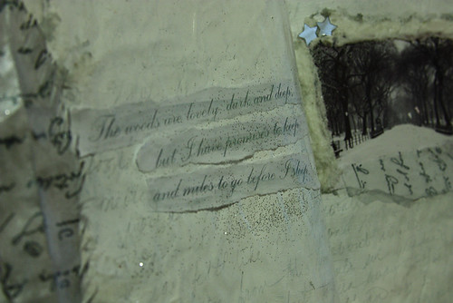
Welcome my color acolytes (this is going to have to stop. I'm going to run out of witty ways to welcome you. *laughs*) Once again I am hosting a color for day five of our Building a Rainbow Challenge hosted over at Daisy Yellow. When you're done here, check out the Daisy Yellow blog to see my partner in crime for today, BLACK.
White is an interesting color as it is in fact the absence of color. It is the symbol of purity and cleanliness. In some cultures it is the color of mourning. White can elude to the delicate, the gossamer and ethereal. It is the mist between worlds and the shorud that hides you from dreams. White is an alpha/omega color. It can be whatever it is that need it to be.
It is also the bane of my exsistence. Now, I have seen gorgeous, fantastic minimalist work done by photographers, artists and journalists. They are masters of the powerful message white can deliver when used correctly. It's just not my color of choice. So, this page was a true challenge for me. I thought: What did I want to convey with this journal page? What feelings did I want to invoke? I decided upon layers. I wanted to stay white on white but that the interest would be texture and layering. I am not sure if I accomplished it to my satisfaction but I have to say that I did like the outcome.:


Some amazing inspiration via Flickr:
1. White Flower / Flower White / Macro / soft macro/, 2. White Daisy / Daisies -, 3. White Lotus Flower Macro / White on white / Lotus, 4. White Flower / Flower Macro / close up flower / closeup / nature / white / : IMGP4921, 5. Soft Macro - White on White - Azalia: IMGP6955, 6. White on white (on white), 7. nights in white satin, 8. white, 9. White, 10. white, 11. White shells, 12. white on white, 13. white sphere, 14. White blossom close up - IMGP6556, 15. white on white 06, 16. WHITE SANDS NATIONAL PARK
How did you incorporate white into your art today?


5 comments:
I love your pages!!! for being such a "pure" color white has a real antique appeal. You don't think about it much actually holding the attention of the piece of artwork you usually think of it as the space you are working on. Tricky color, that white.
~Dawn
A lovely page.
Thanks for the inspiration. I really like the delicate pencil writing on the white paint. beautiful
These pages have wonderful texture. They draw you in - wonderful job!
@Dawn - Thank you! I agree it's such a tricky thing to work with but I stuck with my aesthetic which tends to look a little worn around the edges. Thank you for commenting!
@Carlene Thank you!
@Marcia It's funny because I think that's my favorite part (besides the paper feather) of the journal spread. :) Thank you for stopping by.
@Kathleen - I think that is what everyone wants out of their journal page. That it draws someone in, even of that person is just you. :) Thanks.
Post a Comment