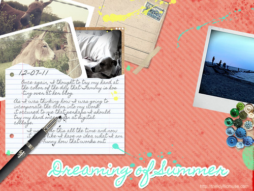
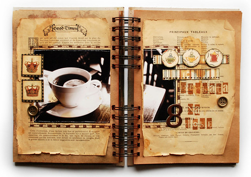
I've been running around all day but found this lovely representation of the color of the day.
Saturday, December 10, 2011
Thursday, December 8, 2011
Daisy Yellow: Building a Rainbow - Five Days of Color: Salmon
Hello everyone and welcome to the five days of color challenge hosted by Daisy Yellow. Please be sure to check out Tammy's blog as she is the hostess for my partner color: Pale Pink.
Salmon is an interesting color as it seems to meander between pink and orange. If you go one or two steps too far either way on the hue chart, you'll have missed that combination that makes Salmon what it is. When I think of this color, automatically my thoughts run into memories of summer. Coconut oil and tanned bodies warming themselves under the noon day sun. It is the color of the Caribbean as you walk past colorful houses brightly painted in cheerful brights that make them look like delicious candy.
For this color I thought I wold revisit something I have no done in ages; Digital art. The amazing thing about digital collage/art is the myriads of things that are at your disposal. You can literally create anything your mind conjures up without having the limitations of materials on hand.
Some inspiration via Flickr:
1. Salmon Colored Buds, 2. Turquoise and Corals Wrap Bracelet, 3. Salmon Lucite Dahlia Cabochons, 4. Raindrops on poppies and whiskers on kittens..., 5. Painted Mural, Cordoba, Spain, 6. Salmon, 7. salmon rice bento, 8. chiyogami paper and salmon coloured resin bangles, 9. Simple Swirl Earrings, salmon, 10. Wall of Cafe Laurent, 11. IMG_7110, 12. Salmon, 13. To Draw You In ..., 14. Salmon?, 15. Gerbera daisy with raindrops, peach color, contrast enhanced, 16. salmon-ish chair
Prompts:
1. Try your hand at something different today. Do you usually go for your watercolors; then why not try acrylics? Do you continuiously buy pre mixed colors (like craft paint?) Well then why don't you try your hand and mixing colors to find the perfect shade of pink or salmon?
2. Find colors in unsual places. Grab your camera and pay attention to the world around you. Can you find the color of the day in your surroundings?
3. Why not add a little hidden note about what the color reminds you of. A small piece of poetry, prose a simple list and then add it to your artwork/journal page in an inconspicuous place.
Make sure you add your links with your work for this color over at Daisy Yellow. :)
Wednesday, December 7, 2011
Technique Spotlight: Color theory
In continuation with yesterday's theme of finding inspiration and tutorials away from the usual places, I give you this lovely little writeup on color by sashas from deviantart. This one focuses on educating the reader on color theory and how it can e used effectively in our art. (These are also things that can be applied to your art journals as well.):
The Color Tutorial - Part 1 by ~sashas on deviantART
The Color Tutorial - Part 2 by ~sashas on deviantART
The Color Tutorial - Part 1 by ~sashas on deviantART
The Color Tutorial - Part 2 by ~sashas on deviantART
Tuesday, December 6, 2011
Technique Spotlight: Paper dying / staining
Many times we get so hyper focused on the community that surrounds us that people tend to forget that there is a larger art community out there with an amazing wealth of knowledge waiting to be shared. Places like Deviantart can be an encyclopedia of information when it comes to art technique. Most if not all offered up for free. The next time you are stuck or wish to experiemnt and learn a new medium, check out sites like Deviantart and see if you can search and discover a few nuggest of wisdom that might take your art in a completely different direction.
Our technique spotlight for today comes from Deviantart and features a few technieques for aging and dying paper. This is a great way to create unique and orignal collage papers for you to use in your art or art journals
How to Dye Paper by `hibbary on deviantART
Our technique spotlight for today comes from Deviantart and features a few technieques for aging and dying paper. This is a great way to create unique and orignal collage papers for you to use in your art or art journals
How to Dye Paper by `hibbary on deviantART
Monday, December 5, 2011
Daisy Yellow: Building a Rainbow - 5 Days of Color: White
Welcome my color acolytes (this is going to have to stop. I'm going to run out of witty ways to welcome you. *laughs*) Once again I am hosting a color for day five of our Building a Rainbow Challenge hosted over at Daisy Yellow. When you're done here, check out the Daisy Yellow blog to see my partner in crime for today, BLACK.
White is an interesting color as it is in fact the absence of color. It is the symbol of purity and cleanliness. In some cultures it is the color of mourning. White can elude to the delicate, the gossamer and ethereal. It is the mist between worlds and the shorud that hides you from dreams. White is an alpha/omega color. It can be whatever it is that need it to be.
It is also the bane of my exsistence. Now, I have seen gorgeous, fantastic minimalist work done by photographers, artists and journalists. They are masters of the powerful message white can deliver when used correctly. It's just not my color of choice. So, this page was a true challenge for me. I thought: What did I want to convey with this journal page? What feelings did I want to invoke? I decided upon layers. I wanted to stay white on white but that the interest would be texture and layering. I am not sure if I accomplished it to my satisfaction but I have to say that I did like the outcome.:
Some amazing inspiration via Flickr:
1. White Flower / Flower White / Macro / soft macro/, 2. White Daisy / Daisies -, 3. White Lotus Flower Macro / White on white / Lotus, 4. White Flower / Flower Macro / close up flower / closeup / nature / white / : IMGP4921, 5. Soft Macro - White on White - Azalia: IMGP6955, 6. White on white (on white), 7. nights in white satin, 8. white, 9. White, 10. white, 11. White shells, 12. white on white, 13. white sphere, 14. White blossom close up - IMGP6556, 15. white on white 06, 16. WHITE SANDS NATIONAL PARK
How did you incorporate white into your art today?
Saturday, December 3, 2011
Daisy Yellow: Building a Rainbow - 5 Days of Color: Aqua
My entry for this color:
Oh, AQUA , How I love thee. You are the color of my dreams floating in the ether. You are the waters of the Caribbean that beckons me in fantasies and the the patina of ancient stories that like to play out in my mind. I draw you out in intricate scrolls and elegant sweeping flourishes. You are the roar of the sea as it crashes upon the shore and the cool smooth porcelain of my favorite tea cup. You are clam and serenity and my affection borders on obsession at times. I might stray and find myself in the playgrounds of other colors but to you I will always return. I just can't help it.
Do you love a color in this manner? Let me know.
1. {121/365} aqua, jodi aqua, 2. Free Little Girl in Turquoise Sea Creative Commons, 3. aqua crinoline hazel atlas teacup, 4. aqua metal, 5. Aqua, 6. Aqua door - Trinidad, Cuba, 7. turquoise bricks, 8. Tiny Flowers, 9. I'm All Alone & It's So Cold, 10. aqua fence, 11. Aqua Skies , 12. Aqua, Green Wreath, 13. Rusty Bell, 14. Orange Koi ~ Turquoise Tile, Um Hmmm!, 15. i don't sleep, i dream, 16. purple martin
This is one of my favorite journal spreads from the lovely Ms. Juliana Coles. Her use of aqua with lavenders, greens, and sepia colors makes me think of an Atlantis where the sun dapples the watery deep.
Friday, December 2, 2011
Daisy Yellow: Build a Rainbow - 5 Days of Color: Yellow
Welcome color warriors to day two of our Building a Rainbow Challenge hosted over at Daisy Yellow. When you're done here, check out the Daisy Yellow blog to see my partner in crime for today, ORANGE.
Below is my own entry for this challenge:
What do you think of when your read the color YELLOW? When I think of the color, the thought of the summer sun filtering through lush green leaves that stretch out into an expansive deep blue sky comes to mind. I think of the way the sand radiates warmth against my skin or the tang of lemonade as it refreshes me on a hot day. Colors are more than a visual. They can morph into sensory triggers. A touch, taste or memory of something that lingers in the back of your mind. So, today when you express yourself using this color - in whatever form it takes - think of what it represents to you and then explore. In the end, you might be surprised as to what comes out.
1. Yellow Rose - IMG_8490, 2. Yellow, 3. yellow 2, 4. guthrie theater yellow room minneapolis, 5. Yellow Pear Tomatoes 012, 6. Yellow Earth, 7. yellow river, 8. Yellow, 9. Yellow Pepper Redone, 10. Yellow sunshine, 11. Yellow multitude, 12. Yellow tulip quintet - Subtle changes, 13. Yellow is a smile, 14. yellow strings, 15. Yellow Wagtail 110418-081, 16. Yellow Fever
I find that yellow isn't a color I see with frequency lately in the land of art journals but look at how vibrant they are when used:
or how they add the right amount of "pop" to a simple yet lovely spread:
Below is my own entry for this challenge:
What do you think of when your read the color YELLOW? When I think of the color, the thought of the summer sun filtering through lush green leaves that stretch out into an expansive deep blue sky comes to mind. I think of the way the sand radiates warmth against my skin or the tang of lemonade as it refreshes me on a hot day. Colors are more than a visual. They can morph into sensory triggers. A touch, taste or memory of something that lingers in the back of your mind. So, today when you express yourself using this color - in whatever form it takes - think of what it represents to you and then explore. In the end, you might be surprised as to what comes out.
A little inspiration in the form of a photo mosaic courtesy of Flickr:
1. Yellow Rose - IMG_8490, 2. Yellow, 3. yellow 2, 4. guthrie theater yellow room minneapolis, 5. Yellow Pear Tomatoes 012, 6. Yellow Earth, 7. yellow river, 8. Yellow, 9. Yellow Pepper Redone, 10. Yellow sunshine, 11. Yellow multitude, 12. Yellow tulip quintet - Subtle changes, 13. Yellow is a smile, 14. yellow strings, 15. Yellow Wagtail 110418-081, 16. Yellow Fever
I find that yellow isn't a color I see with frequency lately in the land of art journals but look at how vibrant they are when used:
Page by Irmute at Flickr
or how they add the right amount of "pop" to a simple yet lovely spread:
Page by Lady Reynolds at Flickr
Thursday, December 1, 2011
Wednesday, November 30, 2011
Technique Spotlight: Mirror Writing
Continuing on from yesterday's theme about incorporating your writing in ways that other people cannot easily decode, I wanted to show something I do on and off to great effect: Mirror Writing.
Mirror writing is formed by writing in the direction that is the reverse of the natural way for a given language, such that the result is the mirror image of normal writing: it appears normal when it is reflected in a mirror. It is sometimes used as an extremely primitive form of cipher. The most common modern usage of mirror writing can be found on the front of ambulances, where the word "AMBULANCE" is often written in very large mirrored text, so that drivers see the word the right way around in their rear-view mirror. (Cited From Wikipedia)
A famous example of this was Leonardo Da Vinci's journals. While no one truly knows why he wrote in this manner some have suggested it was to hide his ideas from rivals.
I love the concept of mirror writing and I do it regularly in my visual journals. Below is a page I did a few months ago. The mirror writing coupled with gesso gives the text an worn antique text feel.. This is another great way to add journaling to your visual pages when you're not comfortable writing. Tomorrow I'll discuss another way to add your journaling into an art journal page in a way that isn't obvious.
Tuesday, November 29, 2011
Build A Rainbow
I am going to be participating as a hostess for Daisy Yellow's Building a Rainbow: 5 days of color challenge. My color is Aqua. This challenge will be running from December 1st - 5th. For more information check out her blog: Daisy Yellow.
Technique Monday: Sharpie Ghosting
Well, I'm already off schedule. Coming back from a long holiday weekend means I walk into work with a lot of things to do. Anyway, better late than never, right?
I've always been a very private person and never have felt truly comfortable writing my thoughts on paper in fear that someone would invade my privacy and read them. This steams from my childhood as my husband of many years would never do such a thing. Still, it is something that I still battle with and it is a reason why visual journaling appeals to me so much. There are though, ways to hide your journaling and this week I'm going to be highlighting some of those ways.
First, I love this technique. It makes for an interesting background and it's a great way to journal something out and have it obscured from the general public (including yourself.)
Sharpie Ghosting via Less Herger of http://comfortableshoesstudio.com
Monday, November 28, 2011
Friday, November 25, 2011
Journal: Ideas Are Plentiful
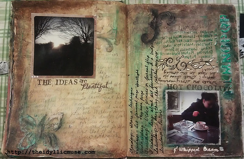
As I have mentioned in another post, I love weathered, antique looking things. I hints at an untold story waiting to be heard. This spread, I was inpisred by this past weeks journal inspiration.
On this page I prepped my pages with a base layer of collage ephemera covering it with a layer of off-white craft paint. To make the page even grungier looking, I spread flexible modeling paste here and there making sure to allow for uneven peaks where my burnt umber glaze could settle into.I then added splashes of green/blue acrylics around the page and printed pictures off of my android phone (the app I love using is called Retro Camera) which lent itself to that vintage look I was looking for. I then journaled about my thoughts on how I wanted to be more consistent with my blogging and how I would accomplish that.
When gathering inspiration from somewhere else, ask yourself, "What do I like about this page?" this will pull you out of trying to replicate someone's work and instead have you focus on your own aesthetic voice allowing you to then apply it to your own work.
Thursday, November 24, 2011
Zen Out and Color In
This is how I tend to relax. I block out a page and begin to doodle slowly each portion until I am done. I then go back and color every part of it, finishing off with a black pen line draw.
Less Herger from http://comfortableshoesstudio.com does something called, Automatic Drawings. Which are these quick sketches that she creates by just letting her hand flow where it feels best. It's an interesting process to watch. This may not be as quick, more of a slow meditative process but it has a similar idea and outcome.
Wednesday, November 23, 2011
Tuesday, November 22, 2011
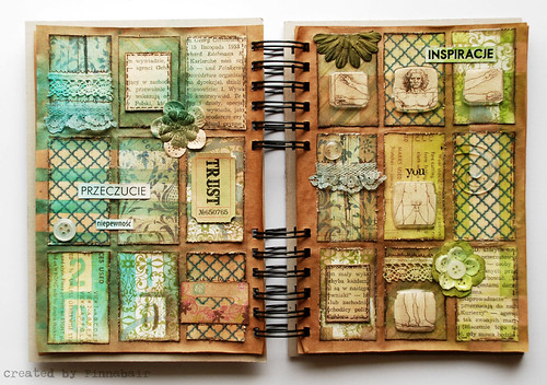
Journal Inspiration: Flickr - Finnabair
I love old weathered things. If you ask me what my favorite color is, I would probably answer "patina," that faded green/blue that hints at crumbling exteriors and stories left to the elements. It is no wonder that I am happiest when my pages lend themselves to their own history - archeology of the mind.
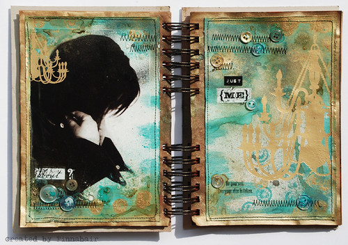
The following pages give me that feeling. Muted colors, sepia tones and warped pages that could easily be found underneath a stairwell at the bottom of an abandoned house.
The following pages are from Flickr member: Finnabair
Monday, November 21, 2011
Technique Mondays
My first technique video comes from RubyClaireART over at Youtube. I love masking tape and using it frequently in my journals. She creates a layered and interesting looking background with paint and some good old fashion masking tape. Enjoy.
Heads up and other words of mystical wonder
I'm going to be trying something new since this poor journal is so neglected it served me with divorce papers.
It is my hope that I can share with you some of the things that inspire me as well as my own work and thoughts on the whole creative process. Currently, I have a number of lovely creative endeavors that make me feel great. Writing (which I never and I mean never do enough of), visual journaling, fine art and crafting (which again, I do not do enough of).
Hopefully I will keep this up and then my poor blog will be happier for it. So, keep on the look out as it is my hope to begin a certain pattern of posting that will allow me to do so with more frequency. Then again, you just never know, I might fall on my face and you'll get to come along for that ride as well.
I remember when I first was introduced to the world of visual journaling I was hungry for information. I scanned and viewed every youtube video, read every blog post, joined creative artjournaling communities on livejournal and tried to gleam from every journal "process" video all in an effort to learn and grow as I embarked on this creative journey. At the time there wasn't as much information available as there is now. There were no on-line workshops and in order to experience it you would have to have the time and money to attend on in person. This made for a lot of experimentation, exploration and discovery on my end. Eventually, people figured ways to make their teaching ability pay online and before you knew it, workshops were popping up everywhere. Now, do not get me wrong, I'm not anti-paid workshops. I believe they can be a great way to expand your knowledge in a nurturing environment of like-minded people. I just feel that we need to remind those who are just starting out on this journey or whom may not have the resources to shell out 30-60-90 dollars for a workshop that they can do it on their own too. There is a plethora of free information out there that will start anyone who is curious about this type of journaling on the right path and keep them there for a good long time. So, this is where you will see the bulk of my posts going to.
So, if you're new, welcome. If not, welcome. At the end of the day my house is open to you and your curious mind.
I hope I don't disappoint.
Jazmin
Sunday, November 20, 2011
Tuesday, November 15, 2011
Personal Creative Style: How can I get it?
Today’s blog post is brought to you by the letter C for cranky repressed creative person. I’m drinking some delicious pumpkin pie liqueur as we speak so I’m sure we can dump the repressed crank in a tick but while I am here in the land of pucker face, I’d like to make a disclaimer: This is only my opinion. It is not the only one on the topic and there is a possibility that it will not even be the opinion you agree with. I’m okay with that. Take what I say with a grain of salt.
One of the things that I continue to see over and over again in the small little art circles I currently frequent (and for those of you not in the, “know” this circle would be of the art journaling aficionado type) is a concern about having your own style or as I like to call it, “uniquism paranoia” How do I find my own style, how do I retain the knowledge I may learn from others and yet not have it make what I do a replica of their creative voice? Well, these are all very good questions my fine creative flock of creatives and I find it is not a topic talked about at length.
First, let us get this out of the way: You’re going to make art that looks like someone else’s at some point in time. This is inevitable. It is part of the learning process, it is the part of the discovery and in all honesty, it’s perfectly normal. Perhaps it is even something that you will enjoy doing for a long while before you move on to other things. That’s just fine and as long as you’re happy and if it brings you joy, then you’re doing it for the right reason. This post is not for you.
On the other hand maybe you’re wondering how you can make your pages a little more authentic, something that is easily recognized as yours. That can be hard, especially if you filled your head with the teachings of every type of art journaling/mixed media guru out there with a book, product or philosophy to sell. So how do you assimilate all of this information and visual stimulus without going into technique overload? Here are a few ideas that may work for you. Try them out and sleep on it for a good week. If they’re not a good fit, throw them out and start over again. That’s the fantastic thing about art. You can always smack some titanium white (or gesso) and begin again
. 1. Try things out without reading up on how others are using it.
A good friend of mine who happens to be a successful fine artist use to say that he was inspired by those who had no idea what they were doing because they were uninhibited and free. Trust your instincts, sometimes being educated in a technique can inhibit you. Personal style for the most part is distinct quirks and imperfections that are unique to the individual. Embrace them, they’re yours.
2. Step outside of the community box.
It’s easy to see what people who share your interests are doing. It’s also easy to fall prey to the nasty inner critic who tells you that whatever it is you do will never be as good as what you’re currently seeing in the community. Venture out and find inspiration in other areas of art. Ask yourself questions as to what you like or dislike about what you’re viewing. This will help understand your aesthetic and inspire you to try new things that appeal to that creative eye.
3. Learn and technique and then forget it.
This was something I left as a response on artjournaling.ning.com to someone new to the community. Supplies, techniques and community can easily overwhelm you. Take whatever it is that you've gleaned so far and throw it out the window. Just don't even think about it. Then open your journal and picking a few things that immediately call to you and do something -anything. I assure you, all the stuff you've been soaking up is in that mind of yours ready to be used but slightly altered by your memory so that what you found important stays with you. That’s the true secret to doing your own thing. It’s learning and filtering that education through the soft gauze of memories.** That way the heart of the technique is there but it has been altered to meet our needs.
There you have it folks. Nothing earth shattering or mind altering but I hope it is helpful nonetheless. The point of the matter is there is plenty for you to do and say without having to following anything currently out there. A little confidence and trust will take you a long way in the road of self-exploration and creative endevors.
** Of course this might be difficult if you have a photographic memory. To you my snapshot minded friend, I am not sure what to say. If you have any ideas of your own, I’d be happy to hear them.
Tuesday, November 1, 2011
Sunday, June 19, 2011
Back in Black
Hello everyone. Instead of boring you with excuses of why I haven't written anything here, I will instead direct your attention to more positive things: Mainly what I am up to this summer. The first thing I'm doing is participating in Index Card A Day project for the summer. I love the concept, I think it's a great way to jump start your creativity and get yourself back into the habit of doing something every day. Check out more about it at Daisy Yellow (link) While the official date has come and gone to join her group, I say you should still do it for yourself and enjoy. Here are all of my cards to date. I began June 1st.
1. ICAD #1, 2. ICAD #2, 3. ICAD #3, 4. ICAD #4, 5. ICAD #5, 6. #ICAD 6, 7. ICAD #7, 8. #ICAD 8, 9. ICAD #9, 10. ICAD #10, 11. ICAD #11, 12. ICAD # 12, 13. ICAD #13, 14. ICAD # 14, 15. ICAD # 15, 16. ICAD # 16, 17. ICAD # 17, 18. ICAD # 18
Subscribe to:
Posts (Atom)